Elevated Retail
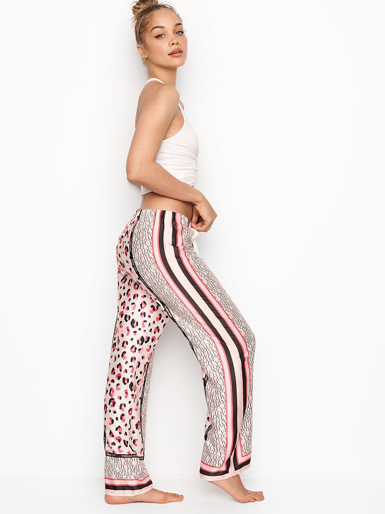
My work sits between creative direction and execution: developing print and color systems that support product, merchandising, and customer-facing cohesion. I think about print not as an isolated artwork, but as part of a broader assortment strategy — how it lives across silhouette, fabrication, color, scale, and seasonal flow.
PRINT DIRECTION
Original motifs + scalable systems
COLOR STRATEGY
Seasonal palettes aligned to product + market


MERCHANDISING ALIGNMENT
Applied across silhouettes + price tiers
SURFACE & MATERIAL
Texture, finish, fabrication integration
DESIGNED FOR SCALE
Built for volume, repeatability, multi-season use
Where Concept Meets Commerce
Developing print and surface systems that align design, merchandising, and product—built to perform at retail.
YEARS INDUSTRY EXPERIENCE
BRANDS
RETAIL EXPERIENCE
GLOBAL
10+
20+
Brand Experience
Victoria’s Secret
VS Pink
Coach
Johnathan Simkhai
Johnny Was
Boggi Milano
Aje Athletica
Fashion
Peloton
Bandier
Equinox
Rhone
Ten Thousand
ASRV
Cuts
Alwrld
Sun Day Red
Performance
Nordstrom
TaylorMade
Title Nine Swim
George Underwear
Rags to Raches
Seissense
Best Fitting Panty
Havn
Greyson
Johnnie-O
Retail/Product
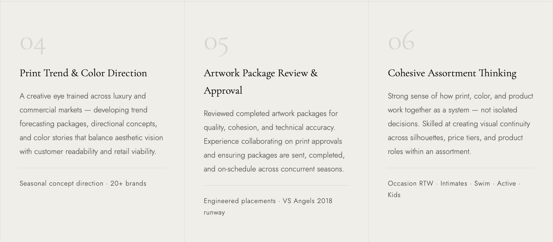
Skills
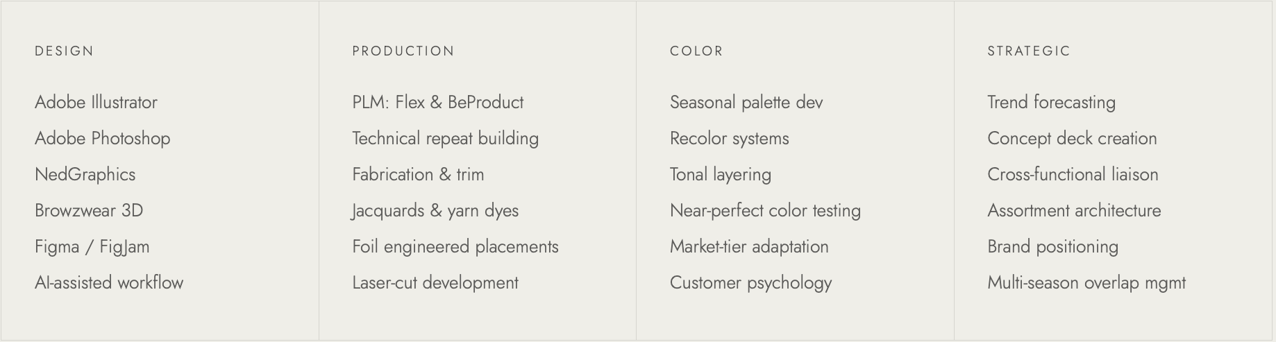
Tools
Case Study
Contemporary Occasion:
Tuscan Destination
Print & Color Strategy
Print & Color Strategy
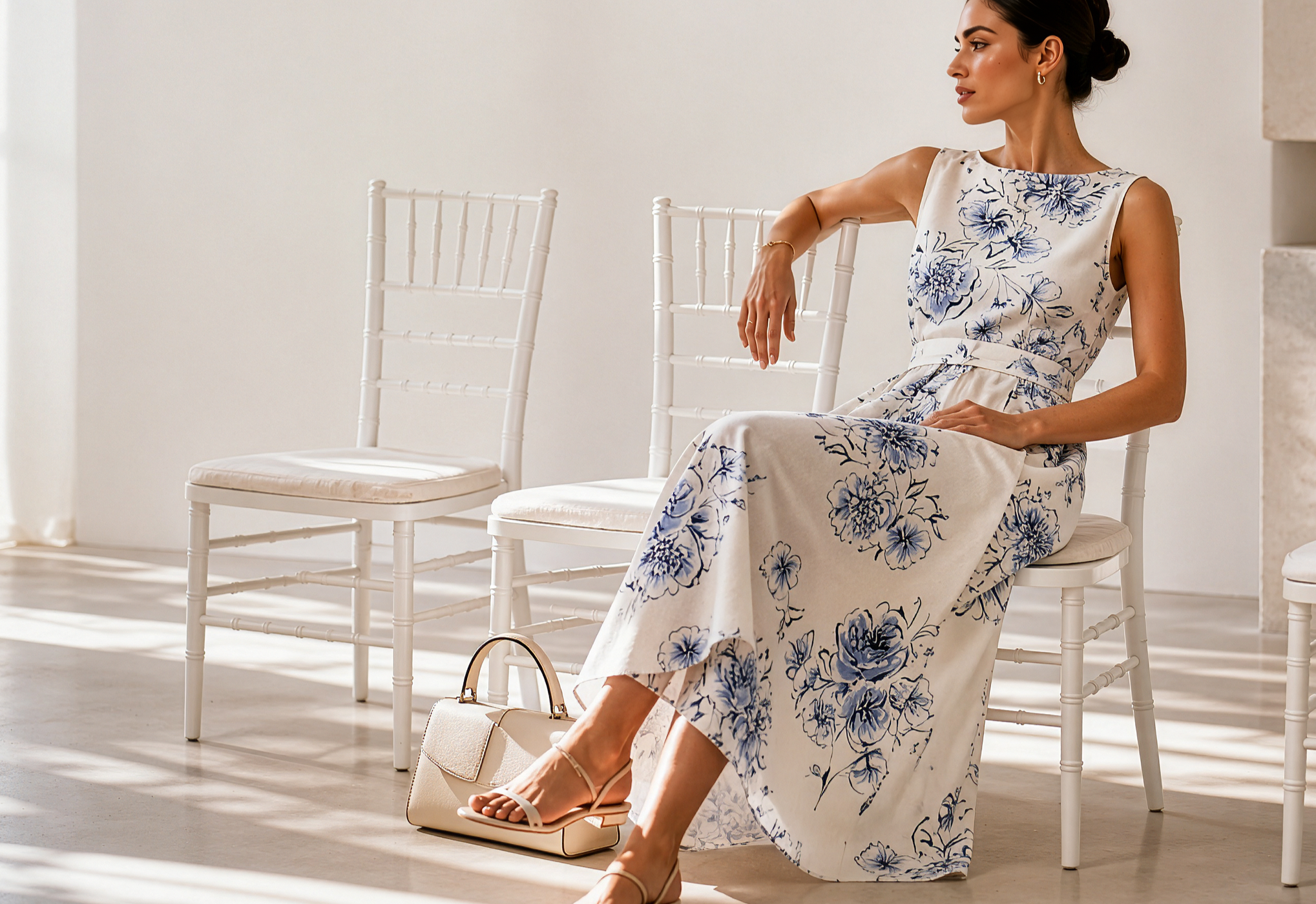
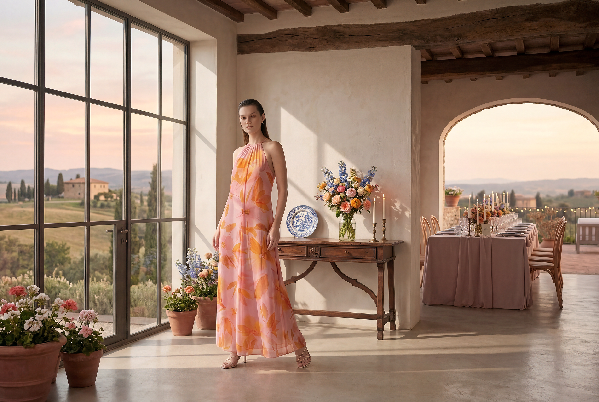
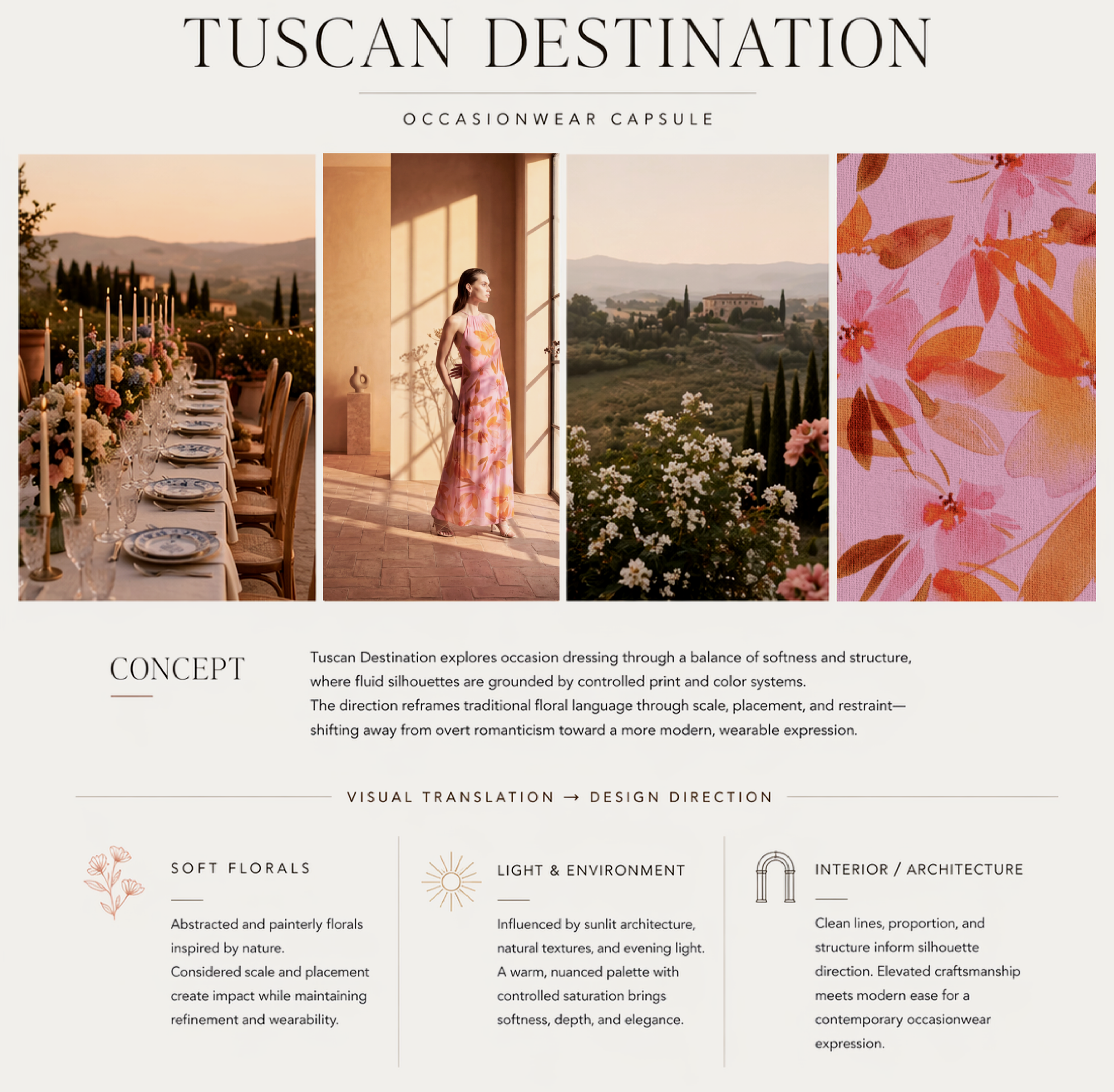
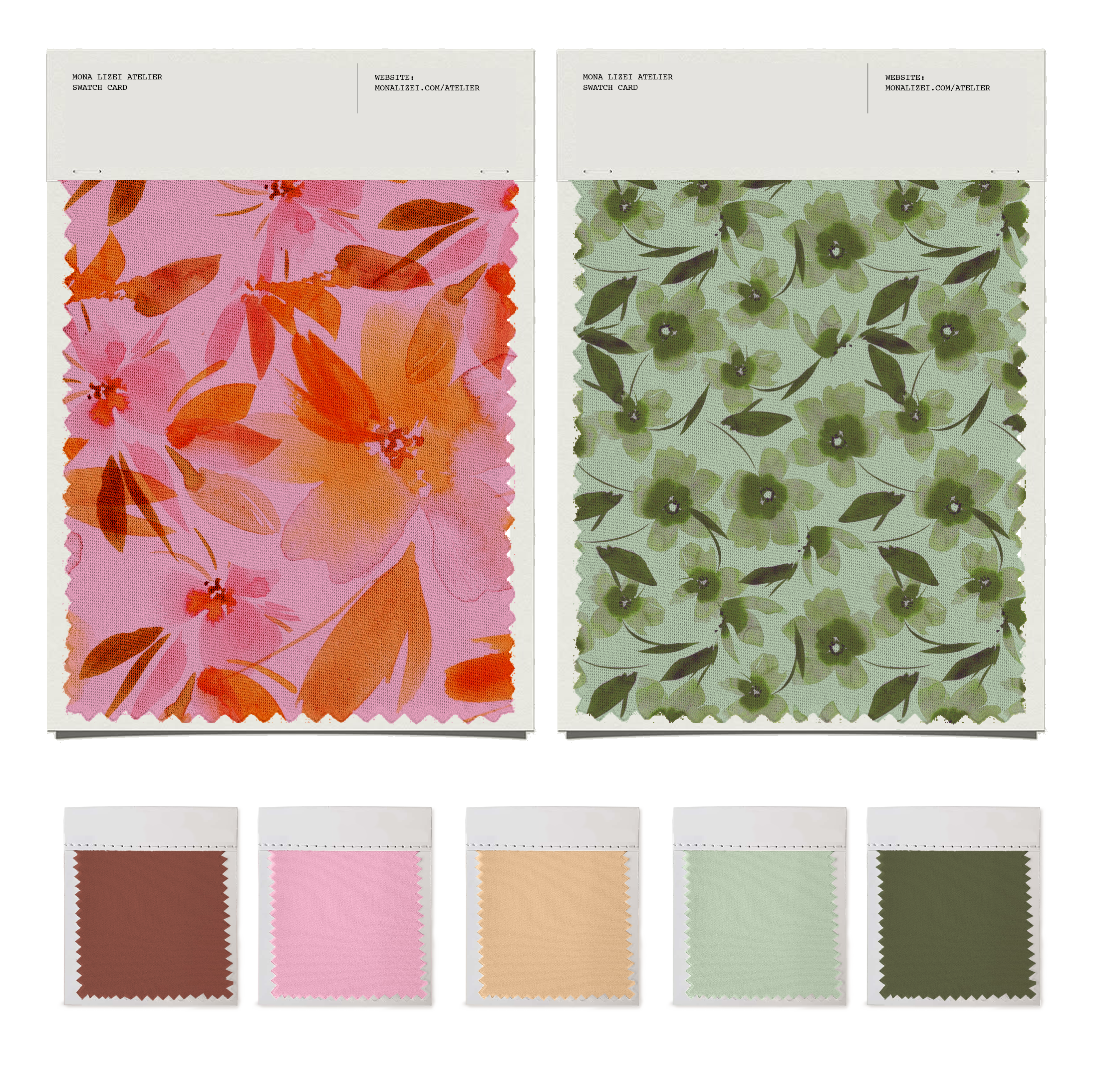
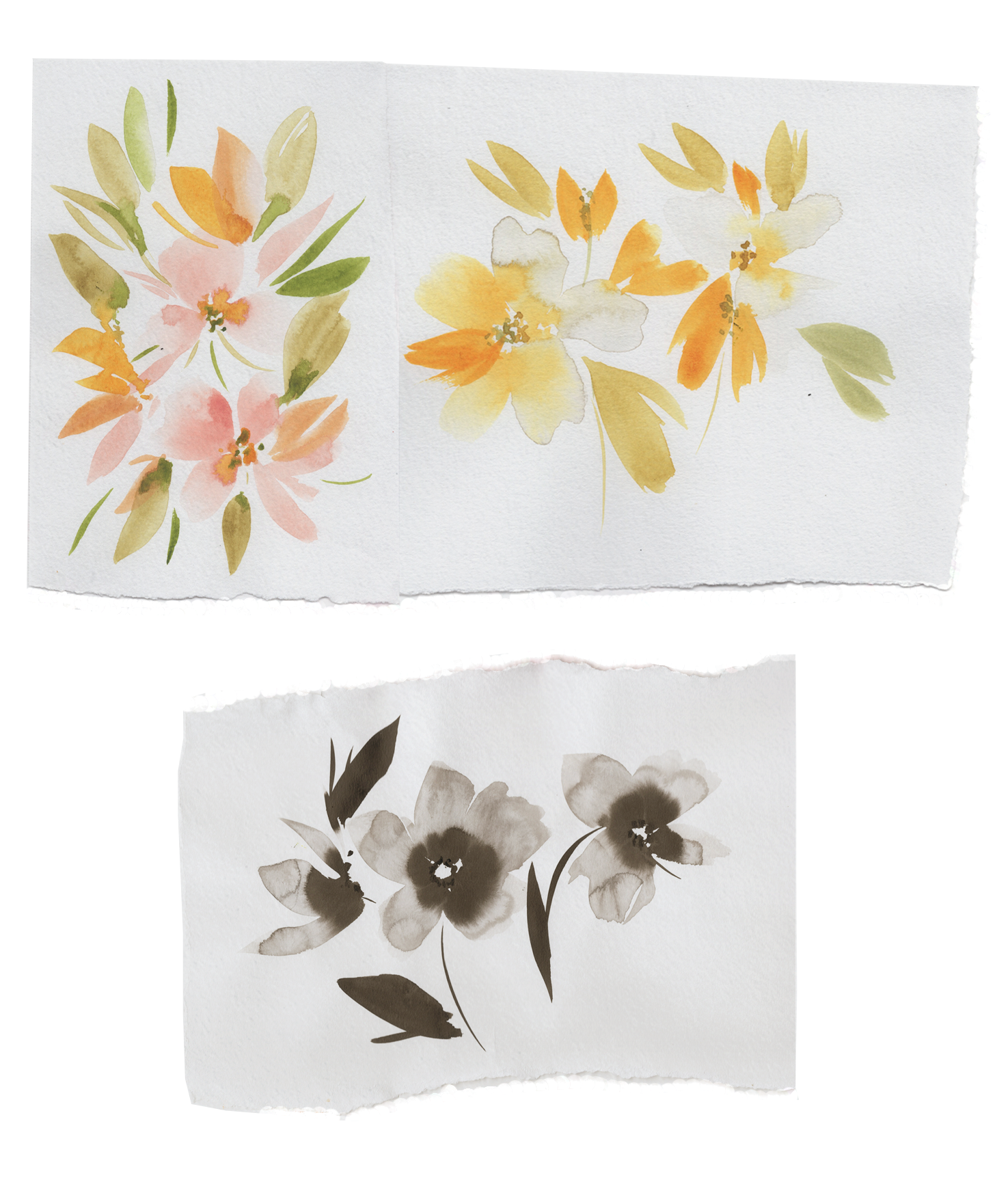
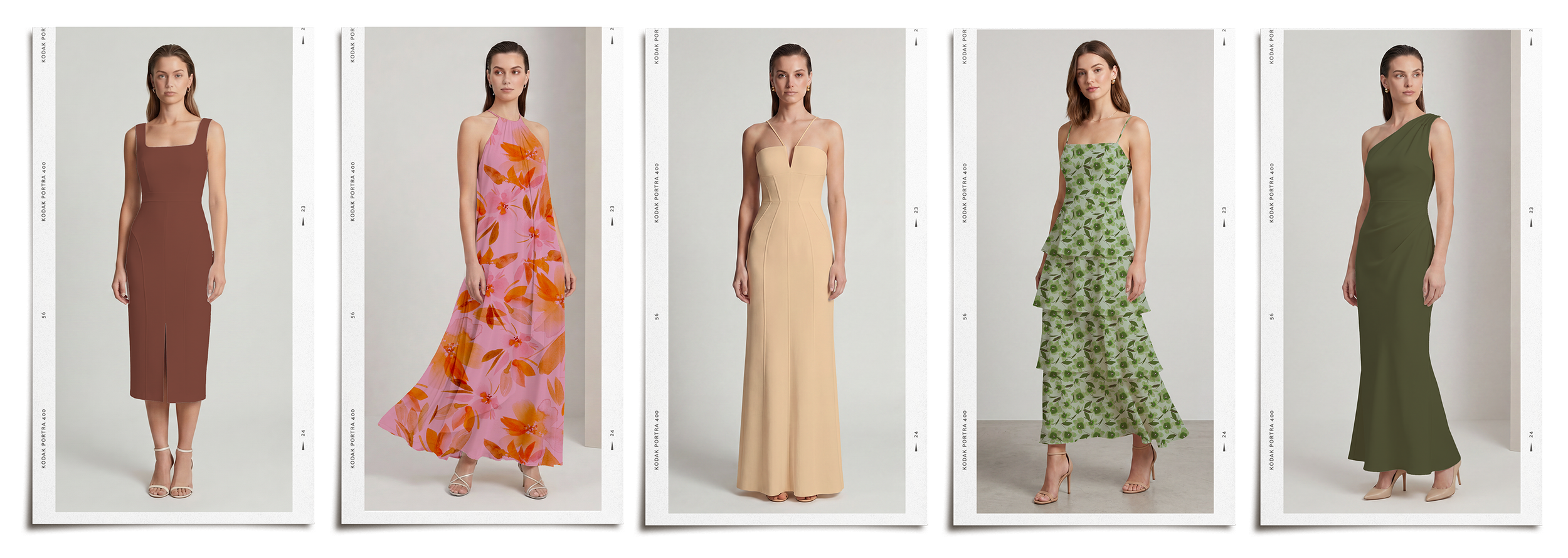
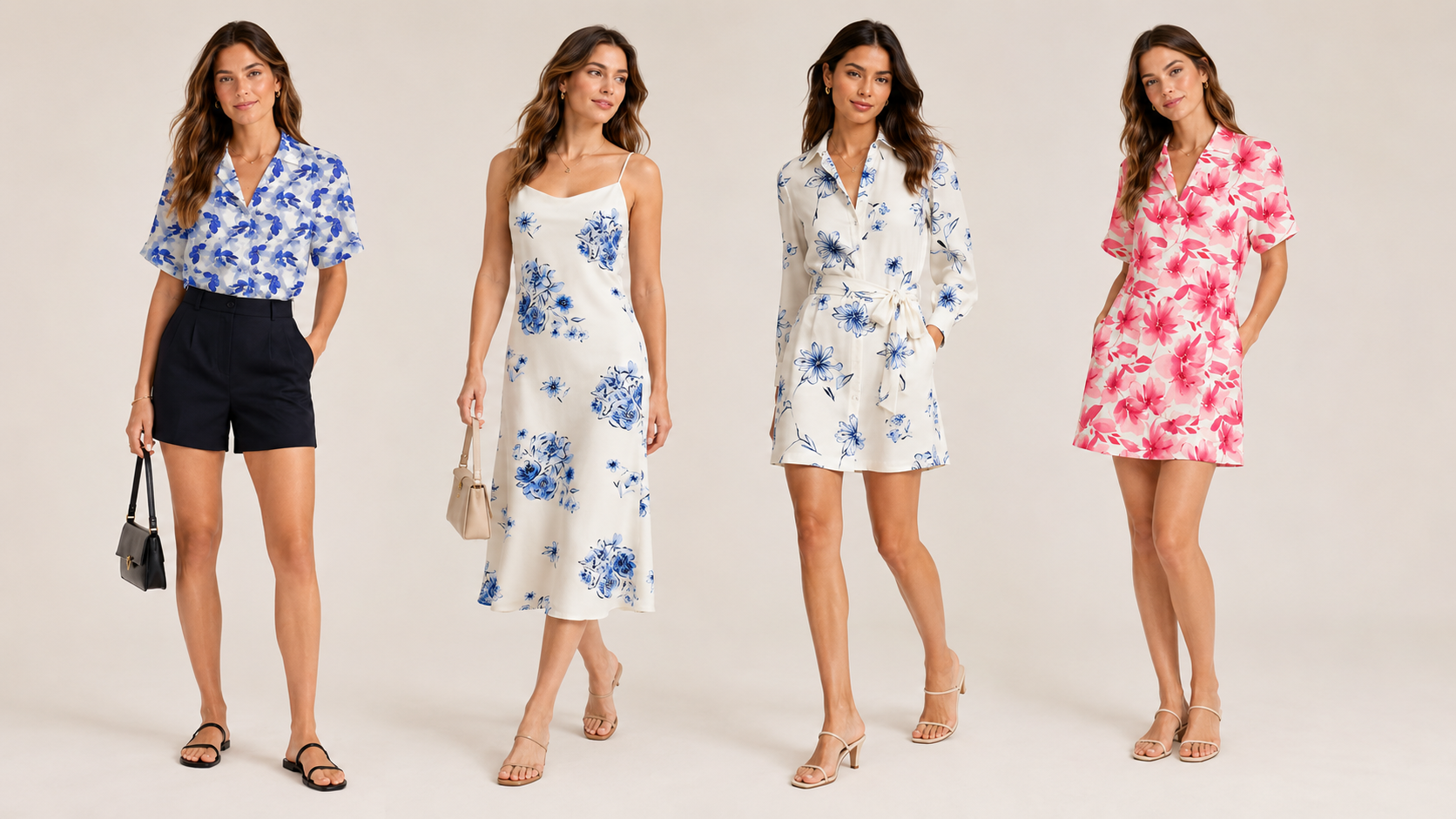
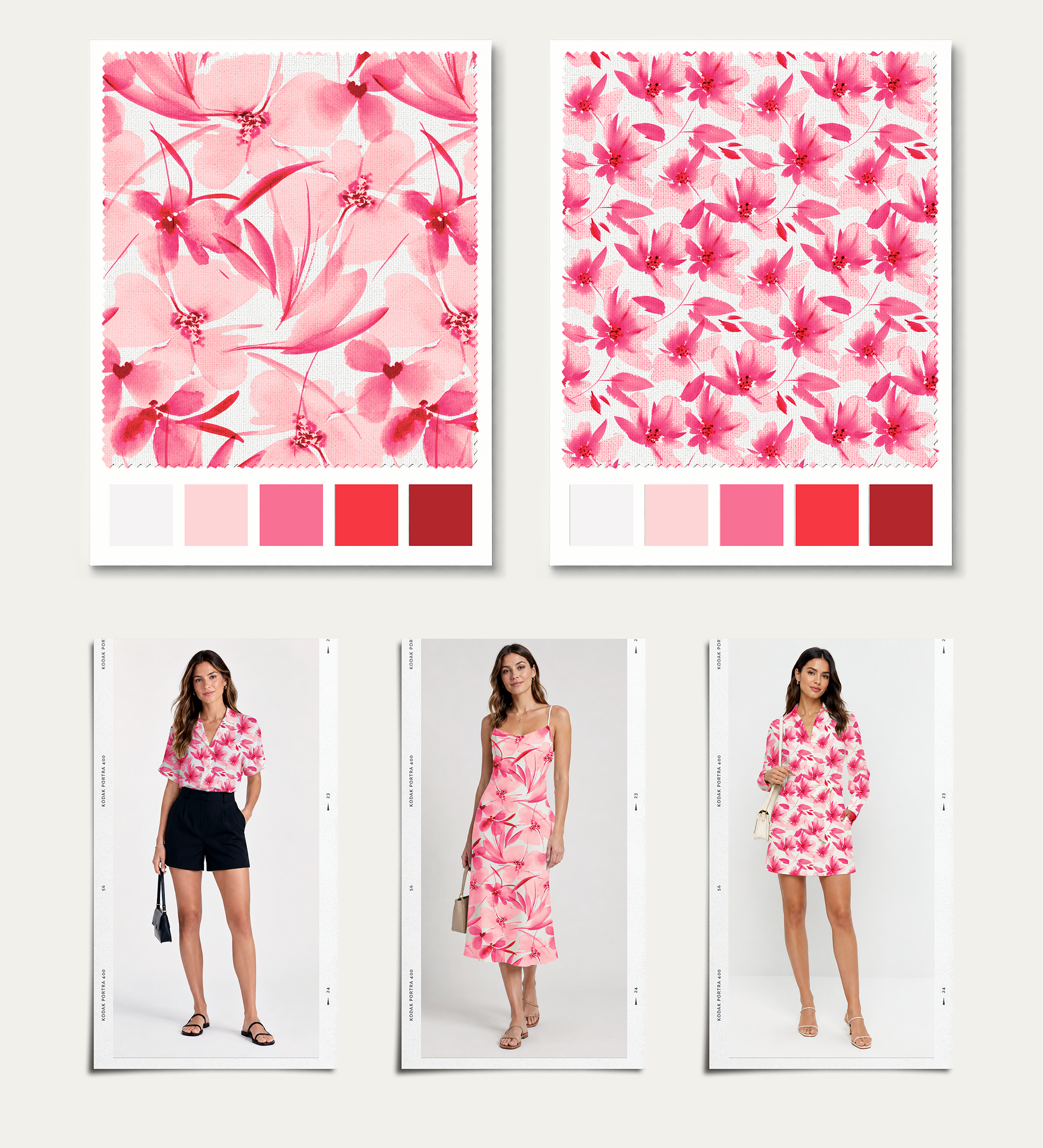
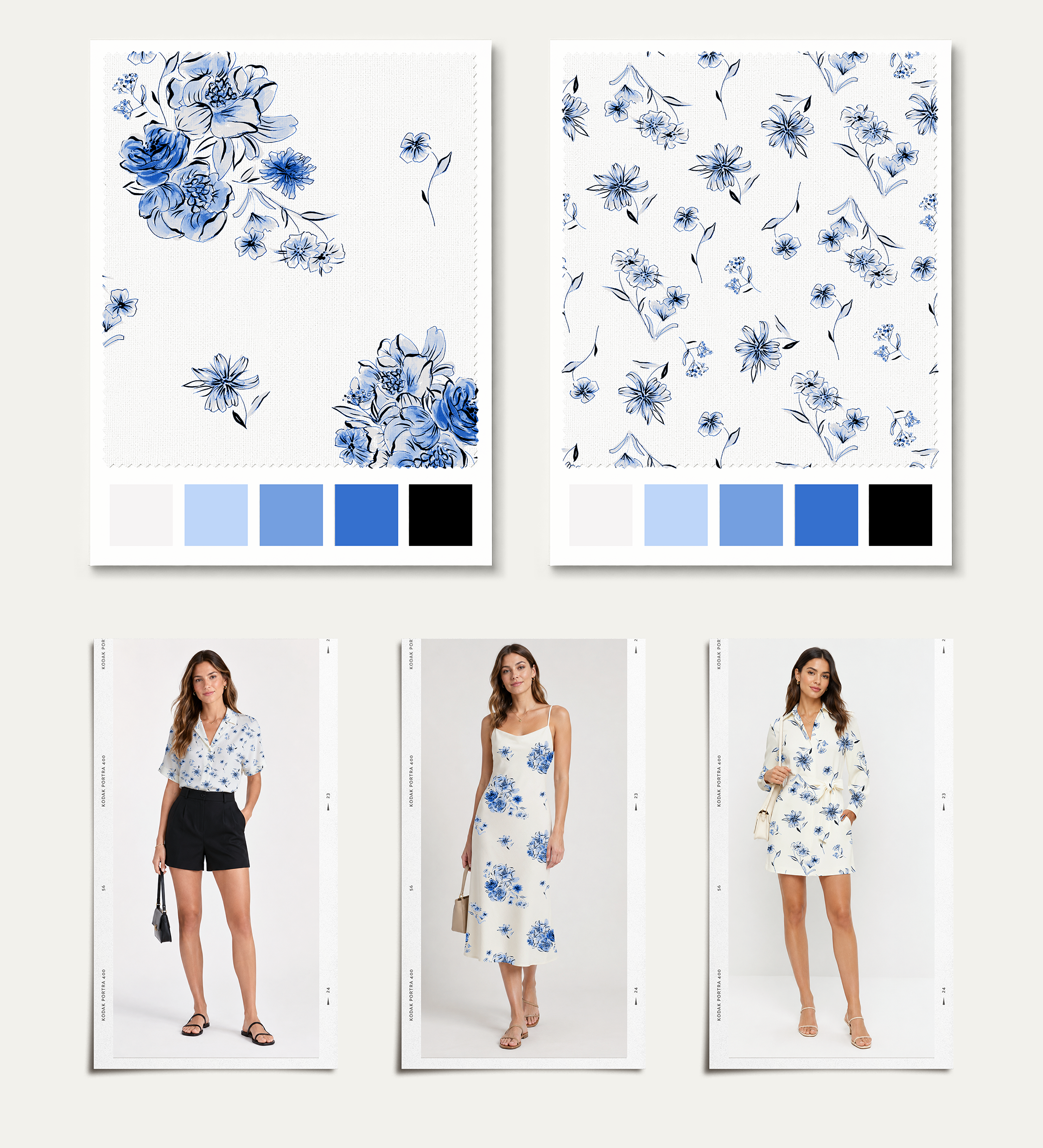
This capsule demonstrates how I build a print and color story into a wearable assortment. The direction balances soft floral artwork with modern silhouettes, controlled color, and commercial versatility — moving from concept and palette into product application and line architecture.
This direction focuses on a hand authored, tightly edited two-print system, balancing a warm, expressive floral with a cooler, structured blue botanical. The reduced system supports merchandising clarity, scalability, and a more elevated, cohesive assortment.
Solids blend with the environment, creating a lush balance of earth and pop with the pinks and golds. The assortment reflects the hillside and warmth of the occasion.
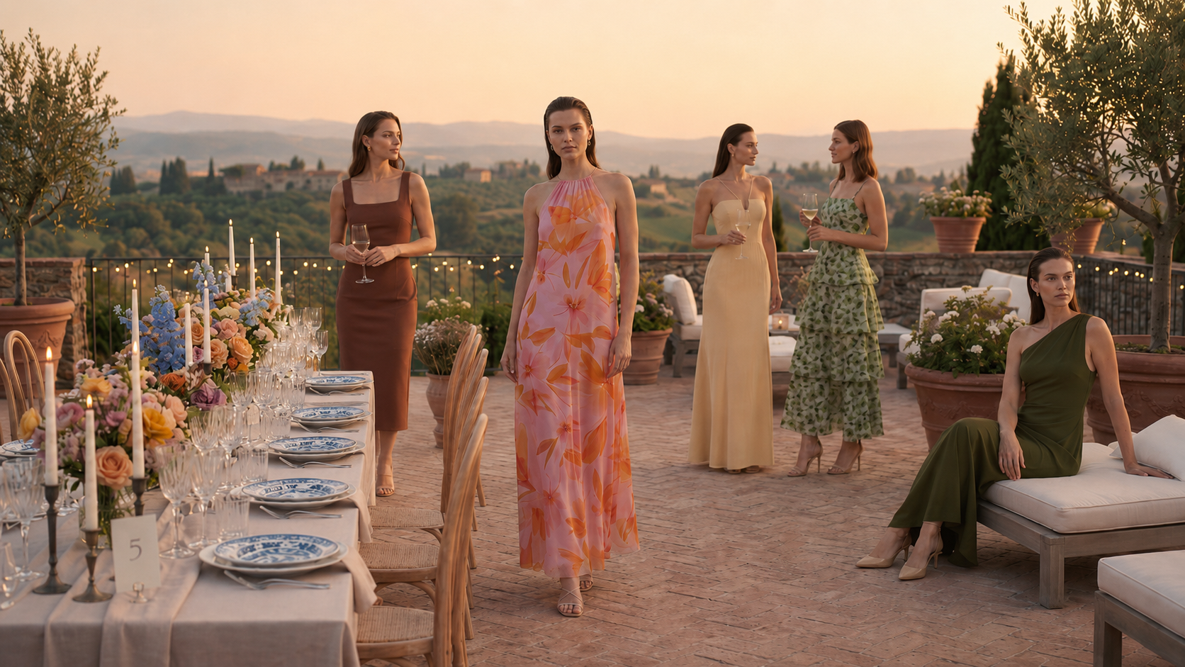
This collection was developed through a world-building approach, where silhouette, print, and color were constructed simultaneously alongside an aspiration environment as part of a cohesive visual system.
AI-assisted workflows were used to quickly iterate on functional silhouettes as well as assess viability of prints in relevant contexts.
Environmental Context
Case Study
Print Families & Authorship
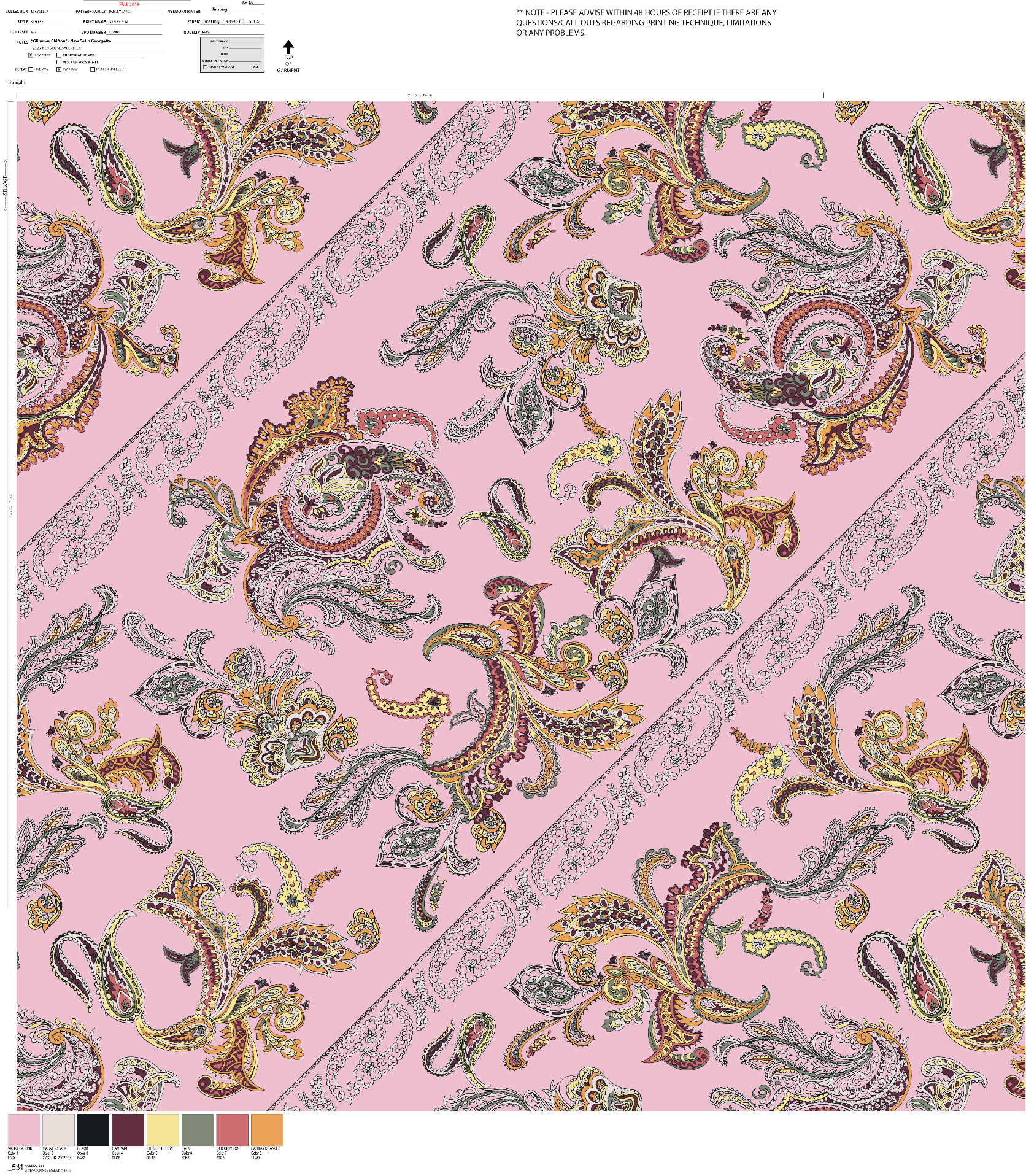
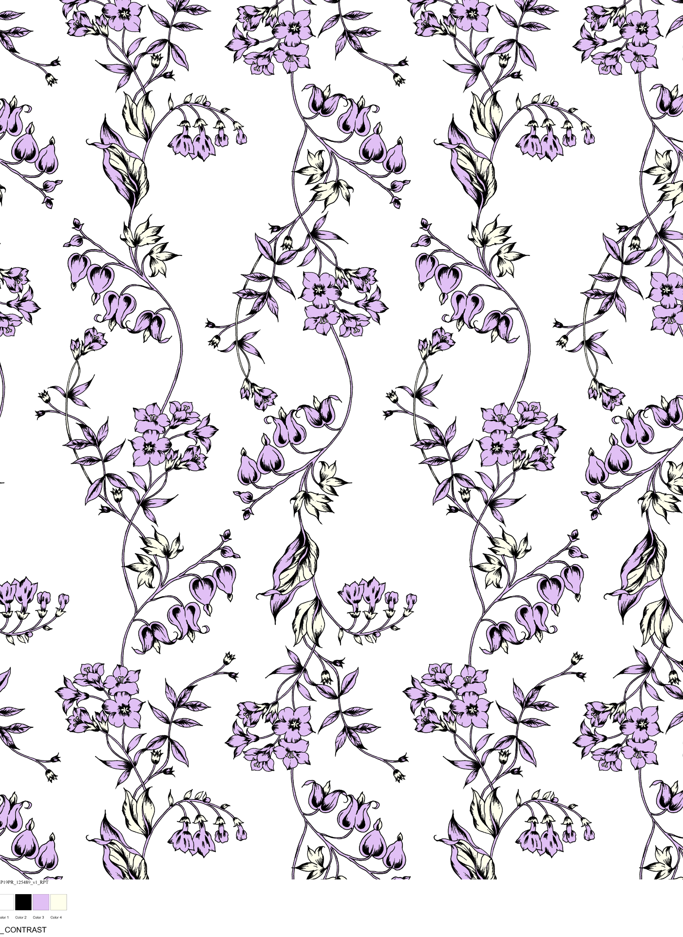
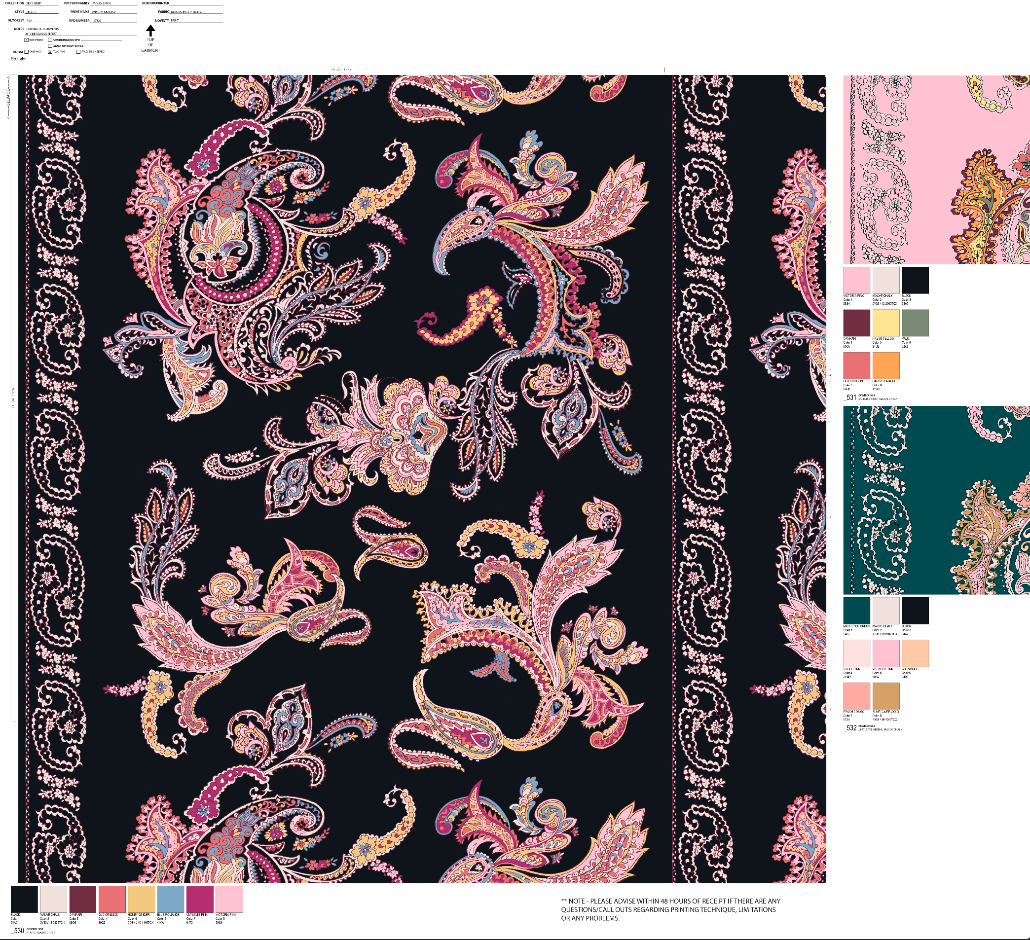
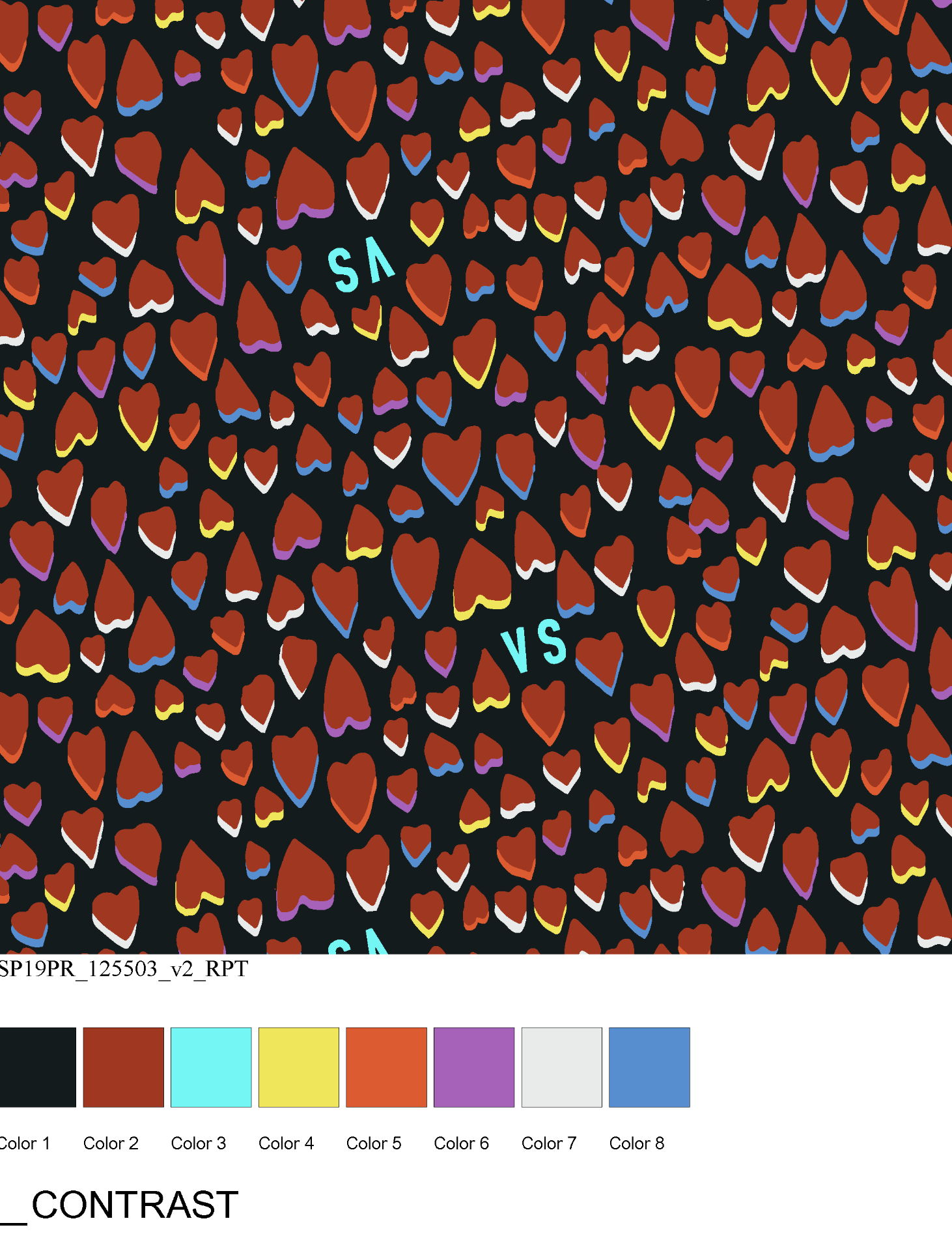
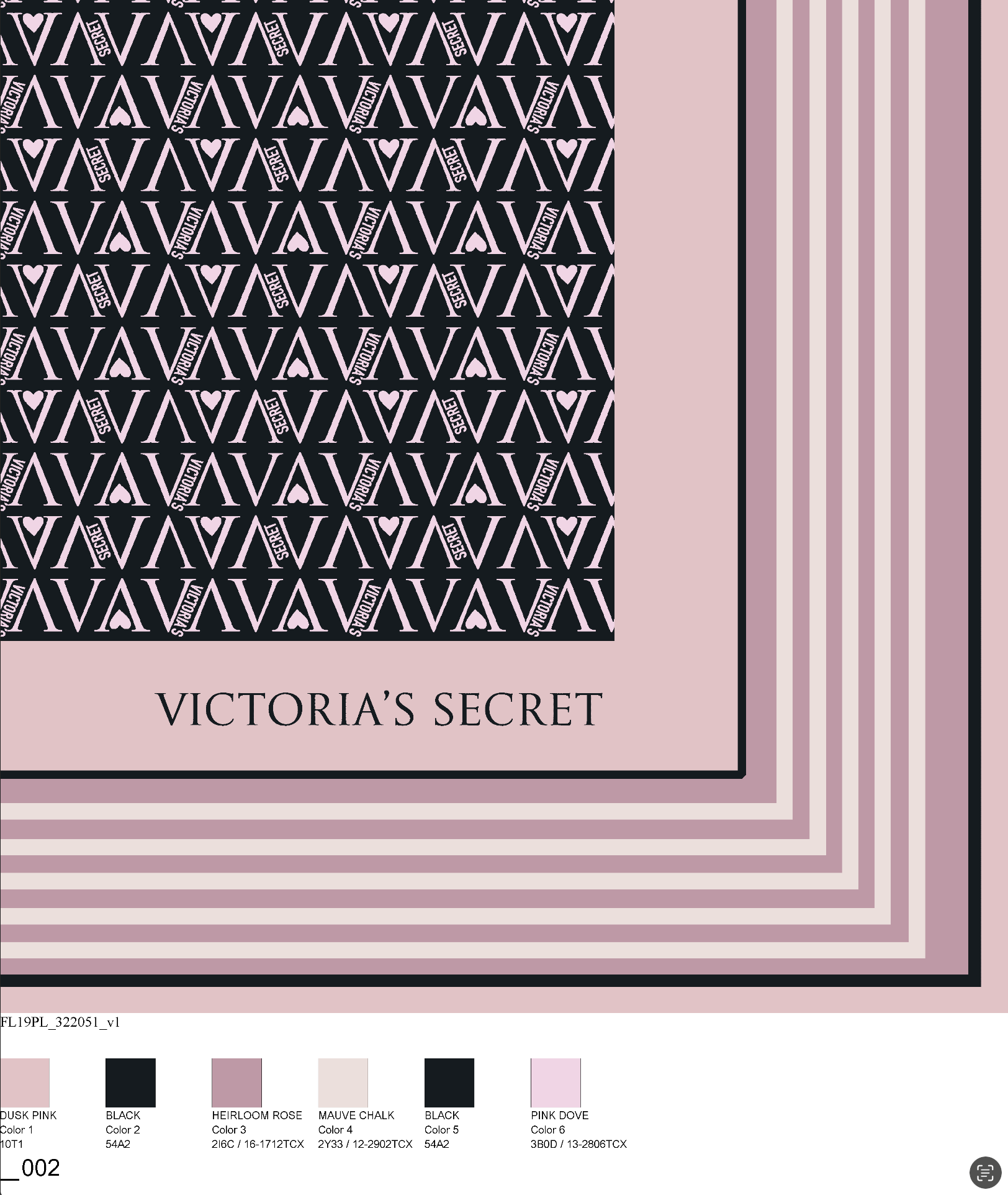
I develop print and color stories with attention to hierarchy: hero prints, supporting textures, quiet grounds, novelty moments, and color families that can flex across product tiers. My goal is to create enough variation for merchandising while preserving a unified visual point of view.

Case Study
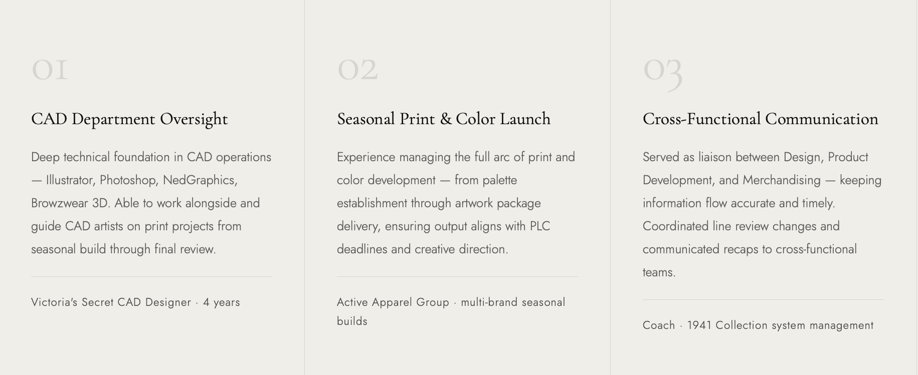
CAD Processes &
Production Fluency
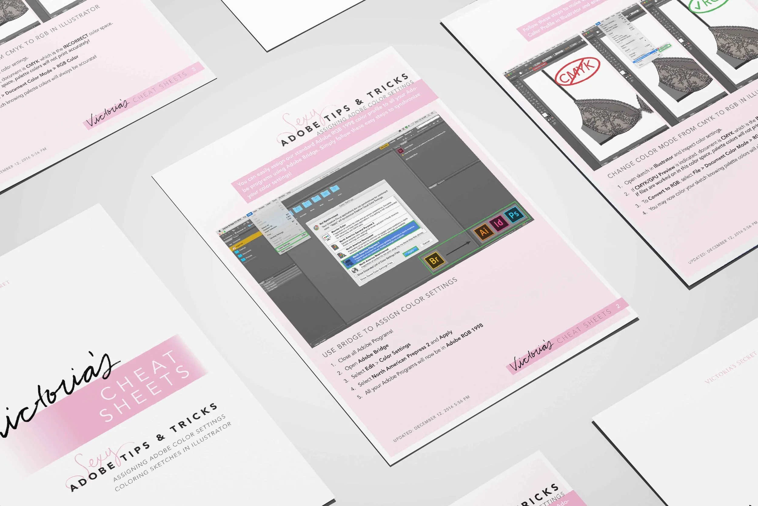
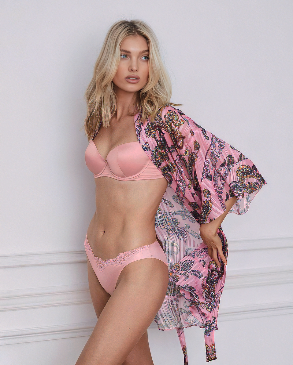
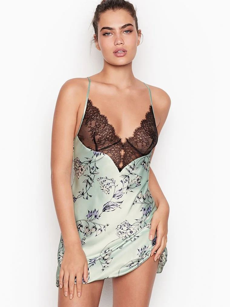
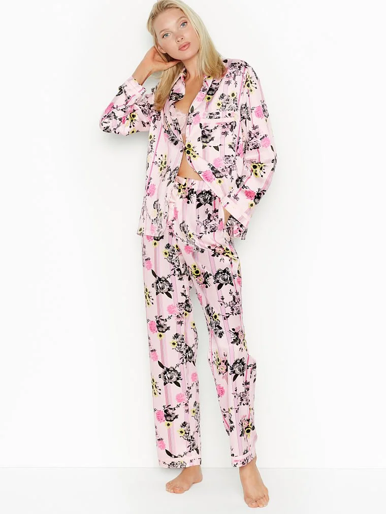
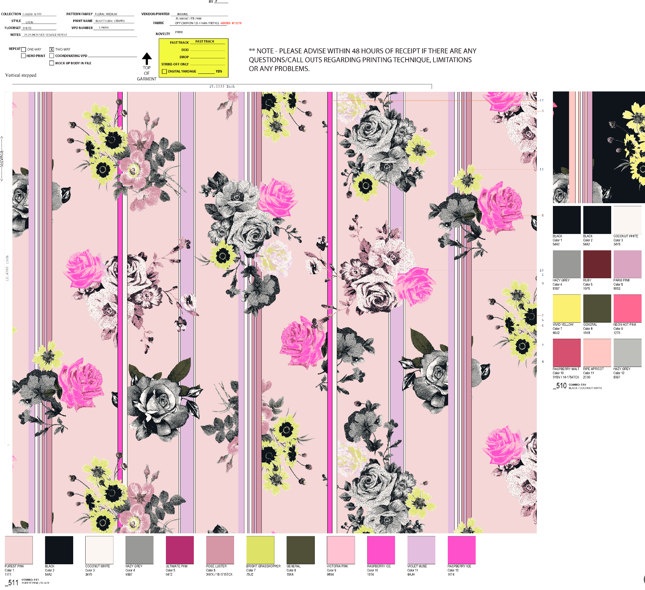
My background includes deep CAD and textile development experience, including repeats, recolors, artwork packages, engineered placements, lace/texture development, and production communication. I understand the importance of preserving the original design intent while making artwork clear, accurate, and executable for mills and cross-functional partners.